
Colour is used by painters in many ways, cave painters would grind the earth around them to mix with water to create reds, ochres and browns to draw animals, Italian Renaissance painters would often depict the Virgin Mary clothed in blue, blue paint was derived from very expensive lapus lazuli to symbolise the esteem in which she is held in the Catholic Church, another symbolic colour is gold that was used by Byzantine artists. As time went by many new colour theories arose, here are two .
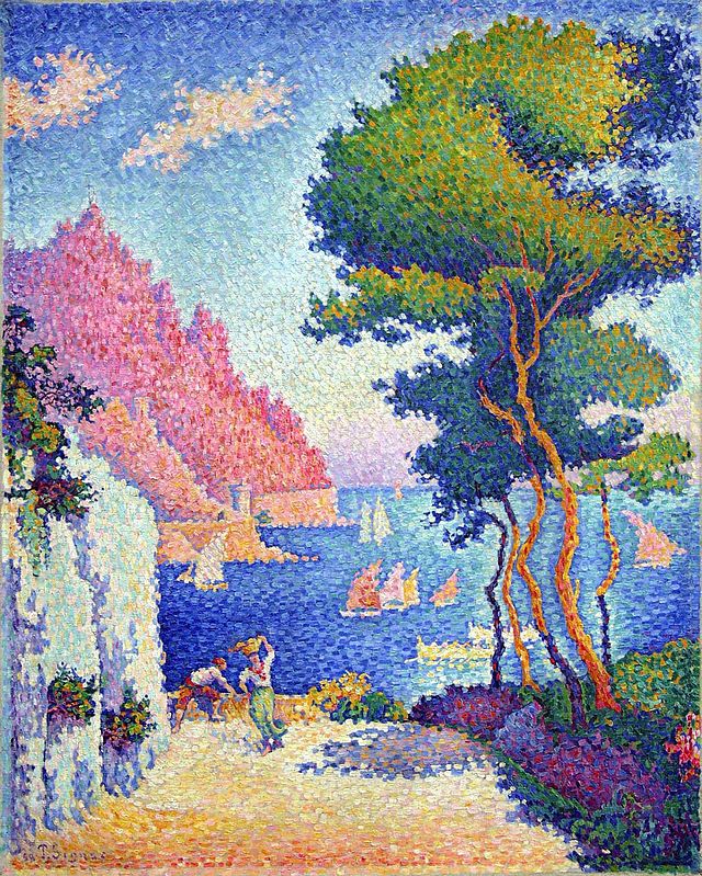
Pointillism. Capo di Noli Italy. 1898.
Paul Signac was born on Paris and began his career studying architecture but then changed his mind and took up painting when he was eighteen after seeing the work of Matisse, he studied the colour theory explained and used by Georges Seurat, they were two French painters who belonged to the group called Neo-Impressionists , Seurat developed the use of pure colour which he applied to his canvases in the form of dots which became known as the Pointillist style having abandoned the Impressionist method of painting with short brushstrokes, it was slow patient work, this experiment meant using scientifically juxtaposed small dots of pure colour which were intended to blend not on the canvas but on the eyes of the viewers. Signac learnt a great deal about this technique from Seurat, they became friends. Signac liked to sail around the coasts of Europe painting landscapes and making water colour paintings of French harbour scenes, the sunlight on the south coast produced sparkling seas and heightened colour. He had met Seurat and also Monet in 1884, Van Gough and Gaugin were also painting at this time. Signac was very interested in the ideas of anarchist communism but had to tone down these ideas in order to gain public acceptance.
I have chosen the painting called Capo di Noli 1898. The sparkling colours expressing the sunshine of Italy are seen in this sea – side view, whether or not you think the colours have merged to create a flat plane is left for the viewer to decide, the brush strokes of the Impressionists rather than dots of colour are perhaps more easily accepted? The shadows are in pale to dark violets set alongside the yellows of the sandy ground. Matisse experimented with pointillist painting but just for a short time.
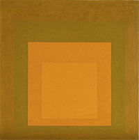 Homage to the Square 1965.Joseph Albers.
Joseph Albers was a German-born American artist who after studying with Johannes Itten at the Bauhaus school was asked by its founder and director Walter Gropius to join the stained glass department to teach foundation students, he also worked with Paul Klee designing glass and furniture. In 1925 the school moved to Dessau, there Albers met a student, Anni, whom he married, he worked there until in 1933 the Nazis closed the school and the artists dispersed. Albers went to live and work as a professor of art at the art school Black Mountain College in North Carolina. In 1950 he left to head the department of design at Yale University, he retired in 1958.
In 1963 he published ‘interaction in Colour’ to demonstrate his theory ‘that colours are governed by an internal and deceptive logic.’ He favoured a very disciplined approach to composition and painted hundreds of works in ‘ Homage to the Square’ in which he explored the chromatic interactions with nested squares. I remember when we students would experiment in a similar way with colour, for example we painted the same colour with a different coloured background, this showed clearly how the colour seemed to change, becoming darker or lighter, or more bright, our colour perception was changed. Albers paintings consisted of three or four squares of solid planes of colour nested within one another. These studies made very interesting viewing I think, although we see a flat surface which seemed to contain no symbols or metaphor in a left brain hemisphere way they do possess a beauty and balance that enriches our sense of colours working together. I wonder what you make of this painting. Mark Rothko painted large canvases with what looks at first like simple flat colour, but there is activity at the edges of the squares and oblong shapes he uses, the intensity and depth of colour can envelop the viewer – perhaps.
images from wikipedia.
I’ve always seen pointillism as painting trying unsuccessfully to become photography – digital photography made up of pixels. The claims to be ‘scientific’ rather reinforce this impression. That would rather involve the imposition of an overbearing concept on the art. I’ve also heard pointillism compared with atomistic philosophies: for example the Buddhist Sarvastivadins (‘advocates of the belief that everything exists’ – in the atomistic analysis of phenomena as ‘dharmas’), Locke and Hume (who thought that our complex ideas were built up from irreducible simple impressions), and early Wittgenstein (who thought that the atomic elements were logical). The idea that seems to bind atomism to pointillism is that our experience can be divided up into tiny pieces that can’t be reduced any further in order to determine what it is ultimately made of, and then put back together, either artistically or conceptually. But this does not seem like a route to engage with experience. As McGilchrist points out, our right hemisphere experience of the senses is holistic and works in gestalts, so it would only be the left hemisphere imposing such an analysis on that gestalt experience.
This picture reminds me of sugar-candy, it looks edible. The colours and the way they are rendered so that light seems to penetrate them from behind, remind me of boiled sweets, a little ‘unnatural’ or ‘artificial’, but pleasing in that boiled sweet way.
I also feel that the colours in this picture convey heat, so that the brilliant surfaces evoke their being very warm or even too hot to touch, the darker surfaces (shaded surfaces) seem cooler. I’m reminded of Mediterranean holidays I’ve enjoyed where I’ve encountered extremes of heat and enjoyed both, and their contrast.
As I’ve remarked before about seascapes, there’s something discordant about the presence of boats. They seem to be stuck in the solid sea rather than floating on its constantly moving surface. I’ve begun to regard boats on the sea as an artistic cliche. This may be an over-valued idea.
Just before I gave up A-level art at school I painted a picture of a boat at sea in a storm. I thought it was awful, and I had to be urged by my art teacher Mr Welburn to complete it, a task I undertook grudgingly and without any enthusiasm. I thought the picture was dire.
However, the picture was inordinately praised by Mr Welburn at a parents’ evening attended by my mother and father, and later exhibited in a gallery of VIth-form achievement at school: I was embarrassed to see it, thinking it a messy daub. Mr Welburn expressed serious disappointment (to my parents but not to me) at my giving up art, as I favoured Latin which I had taught myself. I think my negativity about boats at sea has a lot to do with that decision, which I now regret, although the Latin has served me well. I often think of Mr Welburn. He suffered from rheumatoid arthritis and had difficulty in holding a paintbrush. I always enjoyed his lessons, although I didn’t think I had any talent for drawing or painting at that time.
Norma, I often think of the pencil drawing task you set us, and my own composition, which was made up of partly unboundaried spaces, which coalesced, and bore rather tentative yet meaningful relationship to each other. That drawing gave me great satisfaction. I think it symbolised for me an awareness of my right hemisphere’s liberation from the conflict that I’d set up with the left. Great art therapy, don’t you think?
Alber’s ‘Homage’ looks to me much like a very precisely dug clay-pit in a turfed garden, viewed from above, but slightly at an angle to the vertical. The clay looks almost the same uniform colour as the clay in my own garden. The only anomaly is the similarly uniform lighting of the ‘vertical’ ‘sides’ and ‘floor’ of the pit. It’s rather like a diagram in a DIY manual, where illustrations combine realism with a stylised accuracy of line and lack of redundant detail or untidiness.
It’s a restful image, executed carefully. Why is clay reddish brown? Presumably there’s some constituent iron compound. Do cats perceive colours as do (most) humans? The clay-pit is quite a lot like the pit into which we lowered our cat Milo, much the same colour. Milo’s female sibling came to sniff at his grave as we covered his corpse with earth. She has put on weight since his decease, which suggests to me that she has taken on his status as ‘top cat’.
Hi Robert and Peter,
Thank you for your comments. I will learn more about atomistic ideas Robert, I can see what you mean. I did wonder if early experiments with (non digital ) photography were a consideration when Signac painted his pointillist work, a unique way in those days to approach painting, now film is ‘in vogue’ and painters have taken a back seat in the search for new ways to create.
I think I could embroider with shiny silk threads a small version of this scene he portrays Peter, I like the boiled sweets comparison. In our northern skies we rarely see such brightness of light although painters still travel to Cornwall to benefit from the clear light they have there, our skies can be beautiful all over the country, I like the vast expanse of sky and cloud we can see from flat Norfolk land for example. Constable’s clouds are very expressive of the weather conditions in Britain particularly in his sketches.
Your imagination has been at work again describing the squares as a pit, you have found depth in the flat surfaces. If the centre square was a different colour it would change the other colours quite subtly or any of the squares for that matter, you might enjoy experimenting with paint and colour combinations. I would be very interested to hear from you what you are doing with pencil and paint at the art classes next year. When I set up art classes for adults in two Devon villages many were delighted to find they really enjoyed the process, I appreciated Prue’s comment about her drawing at the retreat. Making pictures can be very therapeutic, I agree.