
Colour is used by painters in many ways, cave painters would grind the earth around them to mix with water to create reds, ochres and browns to draw animals, Italian Renaissance painters would often depict the Virgin Mary clothed in blue, blue paint was derived from very expensive lapus lazuli to symbolise the esteem in which she is held in the Catholic Church, another symbolic colour is gold that was used by Byzantine artists. As time went by many new colour theories arose, here are two .
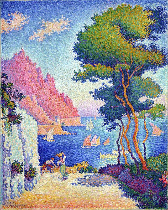
Pointillism. Capo di Noli Italy. 1898.
Paul Signac was born on Paris and began his career studying architecture but then changed his mind and took up painting when he was eighteen after seeing the work of Matisse, he studied the colour theory explained and used by Georges Seurat, they were two French painters who belonged to the group called Neo-Impressionists , Seurat developed the use of pure colour which he applied to his canvases in the form of dots which became known as the Pointillist style having abandoned the Impressionist method of painting with short brushstrokes, it was slow patient work, this experiment meant using scientifically juxtaposed small dots of pure colour which were intended to blend not on the canvas but on the eyes of the viewers. Signac learnt a great deal about this technique from Seurat, they became friends. Signac liked to sail around the coasts of Europe painting landscapes and making water colour paintings of French harbour scenes, the sunlight on the south coast produced sparkling seas and heightened colour. He had met Seurat and also Monet in 1884, Van Gough and Gaugin were also painting at this time. Signac was very interested in the ideas of anarchist communism but had to tone down these ideas in order to gain public acceptance.
I have chosen the painting called Capo di Noli 1898. The sparkling colours expressing the sunshine of Italy are seen in this sea – side view, whether or not you think the colours have merged to create a flat plane is left for the viewer to decide, the brush strokes of the Impressionists rather than dots of colour are perhaps more easily accepted? The shadows are in pale to dark violets set alongside the yellows of the sandy ground. Matisse experimented with pointillist painting but just for a short time.
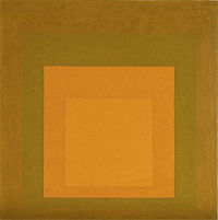 Homage to the Square 1965.Joseph Albers.
Joseph Albers was a German-born American artist who after studying with Johannes Itten at the Bauhaus school was asked by its founder and director Walter Gropius to join the stained glass department to teach foundation students, he also worked with Paul Klee designing glass and furniture. In 1925 the school moved to Dessau, there Albers met a student, Anni, whom he married, he worked there until in 1933 the Nazis closed the school and the artists dispersed. Albers went to live and work as a professor of art at the art school Black Mountain College in North Carolina. In 1950 he left to head the department of design at Yale University, he retired in 1958.
In 1963 he published ‘interaction in Colour’ to demonstrate his theory ‘that colours are governed by an internal and deceptive logic.’ He favoured a very disciplined approach to composition and painted hundreds of works in ‘ Homage to the Square’ in which he explored the chromatic interactions with nested squares. I remember when we students would experiment in a similar way with colour, for example we painted the same colour with a different coloured background, this showed clearly how the colour seemed to change, becoming darker or lighter, or more bright, our colour perception was changed. Albers paintings consisted of three or four squares of solid planes of colour nested within one another. These studies made very interesting viewing I think, although we see a flat surface which seemed to contain no symbols or metaphor in a left brain hemisphere way they do possess a beauty and balance that enriches our sense of colours working together. I wonder what you make of this painting. Mark Rothko painted large canvases with what looks at first like simple flat colour, but there is activity at the edges of the squares and oblong shapes he uses, the intensity and depth of colour can envelop the viewer – perhaps.
images from wikipedia.